WoleverEntun
Legacy Supporter 3
- Joined
- Apr 6, 2011
- Location
- Korea
Me too.
Alright, So what else ,as far as text is concerned, would you like to add to it? Does LF have a motto or saying?Me too.

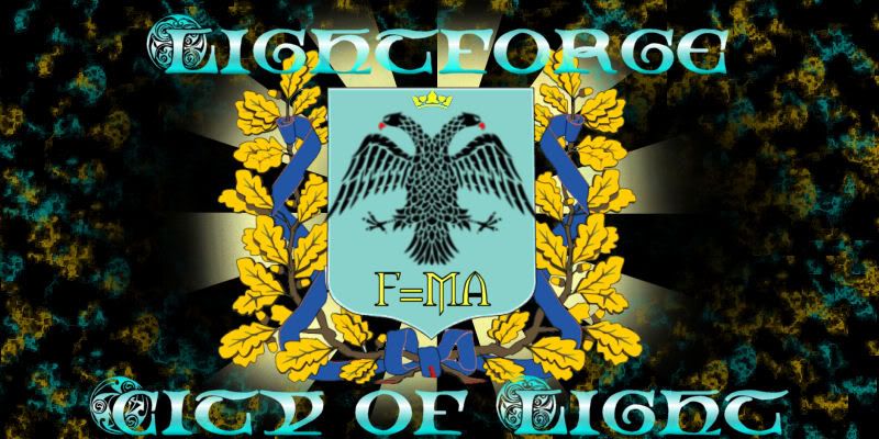
This is what ive got so far. @WoleverEntun I tried using the colors you recommended but it needed more contrast to be easier on the eyes so I added the black background. I kept the dual-headed bird from the original coat of arms and added F=MA to it and I used the font we agreed on to do Lightforge at the top and City of Light on bottom and added in the white to go along with the Gold,Light Blue, and White color scheme which caused it to have a metallic reflection which I think makes a nice effect. All in all, I tried to add enough to make it look presentable and good enough to represent Lightforge while also not making it overcrowded with effects to ruin the quality.
So, what does everybody think? With it being my first time trying anything like this I would really like some feedback and suggestions and maybe some constructive criticism.
No, I got the coat of arms template off the internet and the dual-headed bird was from LF's original coat of arms on page 1 of this thread. the rays in back are from a different picture. the text is really a font i downloaded. Soooo, the only thing i really did was the gold and blue blotches in the background and shaping the rays(it used to be a square)Did you draw all of that?
This is what ive got so far. @WoleverEntun I tried using the colors you recommended but it needed more contrast to be easier on the eyes so I added the black background. I kept the dual-headed bird from the original coat of arms and added F=MA to it and I used the font we agreed on to do Lightforge at the top and City of Light on bottom and added in the white to go along with the Gold,Light Blue, and White color scheme which caused it to have a metallic reflection which I think makes a nice effect. All in all, I tried to add enough to make it look presentable and good enough to represent Lightforge while also not making it overcrowded with effects to ruin the quality.
So, what does everybody think? With it being my first time trying anything like this I would really like some feedback and suggestions and maybe some constructive criticism.
Still somewhat impressive. What program do you use? I think the background should be slightly different and the colour of it should be opposite of the text. Thats my picky side.No, I got the coat of arms template off the internet and the dual-headed bird was from LF's original coat of arms on page 1 of this thread. the rays in back are from a different picture. the text is really a font i downloaded. Soooo, the only thing i really did was the gold and blue blotches in the background and shaping the rays(it used to be a square)Did you draw all of that?
This is what ive got so far. @WoleverEntun I tried using the colors you recommended but it needed more contrast to be easier on the eyes so I added the black background. I kept the dual-headed bird from the original coat of arms and added F=MA to it and I used the font we agreed on to do Lightforge at the top and City of Light on bottom and added in the white to go along with the Gold,Light Blue, and White color scheme which caused it to have a metallic reflection which I think makes a nice effect. All in all, I tried to add enough to make it look presentable and good enough to represent Lightforge while also not making it overcrowded with effects to ruin the quality.
So, what does everybody think? With it being my first time trying anything like this I would really like some feedback and suggestions and maybe some constructive criticism.
I usealy use auto desk's sketchbook, Gimp, inkscape and some random thing I found on my computer.Thanks, I use Paint Shop Pro 9. It was really hard to get used to and I much prefer to use Photohop. I experimented with the background color instead of black but choosing any lighter color caused the rest to be not as visible and it also became hard to look at.
What do you think @WoleverEntun ?